Yota
Fintech
B2C
Design system
Web
— Ideation & CJM
— Research
— UI/UX Design
— Design support
— Promo
June 2020 — August 2021
I provided design support for one of the largest mobile operators in the country. This involved a comprehensive overhaul of their design, including revamping promo sites, the mobile application, and other related aspects.
My involvement began with a successful participation in a competitive tender. I completed and triumphed in the test task assigned as part of the tender process.
Tender e-sim order
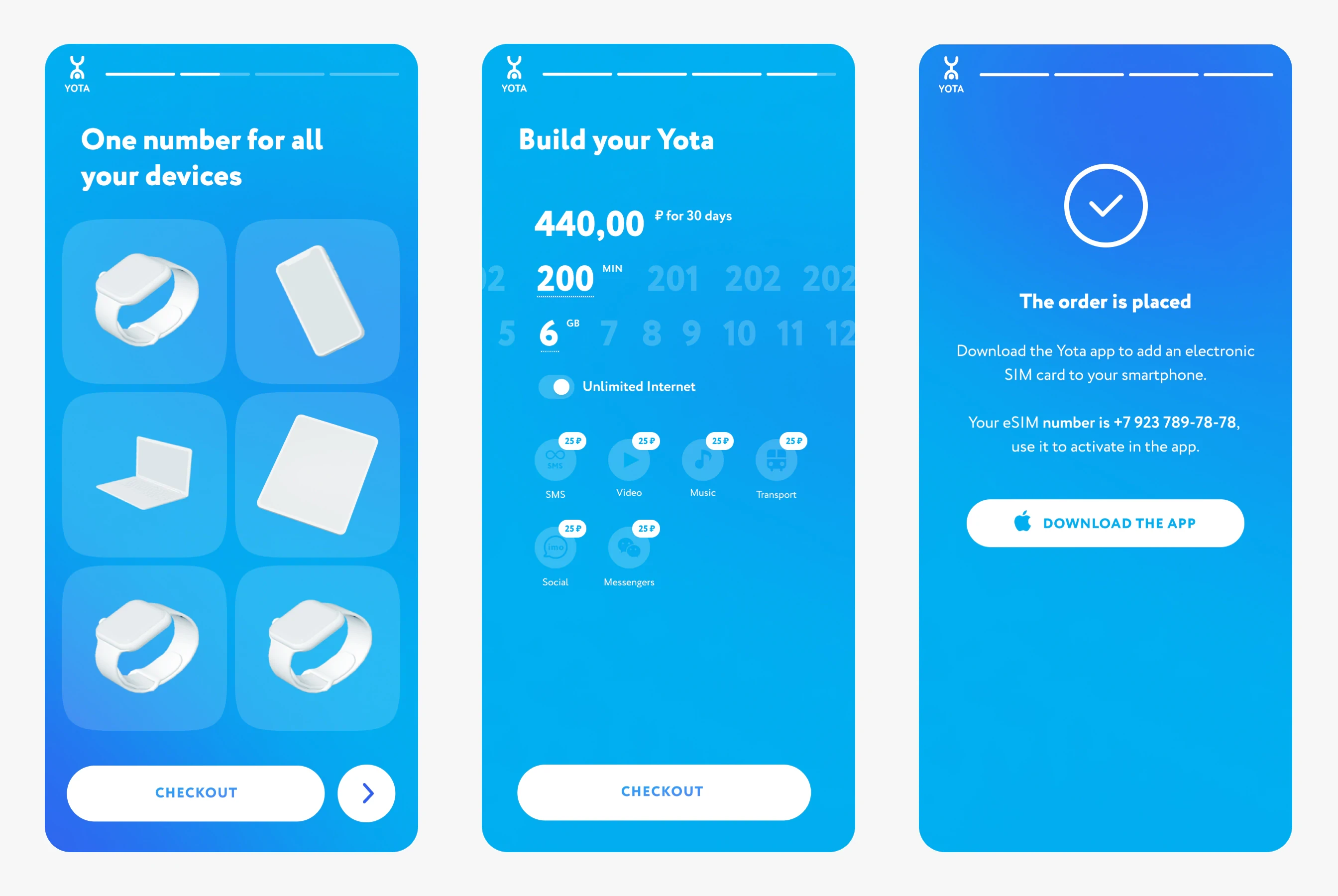
The test task for cooperation was the design of the e-sim ordering process, the promo page and the redesign of the service calculator. Since the product is more aimed at mobile device users, it worked on the mobile first principle. When redesigning the order form, the goal was to shorten the user’s path and update the UI.


Redesign SIM order
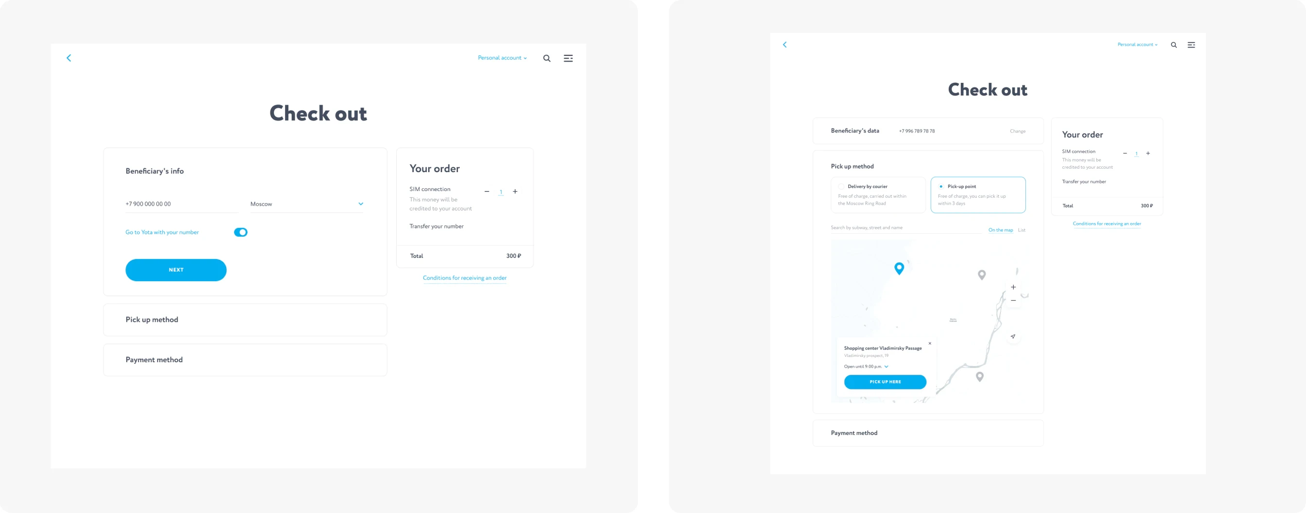
I worked on altering the feedback form logic and interface tasks that influenced the user experience of our products. These tasks ranged from implementing a persistent message in the app’s chatbot to rethinking the sequence for generating a city list in the application form.
Following initial analysis, we opted for a modular system, where information is organized into visually distinct card-like blocks. These blocks can then be prioritized using color framing in Yota’s brand colors, creating a seamless visual hierarchy.
The modular approach has been employed across various Yota interfaces and has proven its effectiveness based on user feedback.
Design support
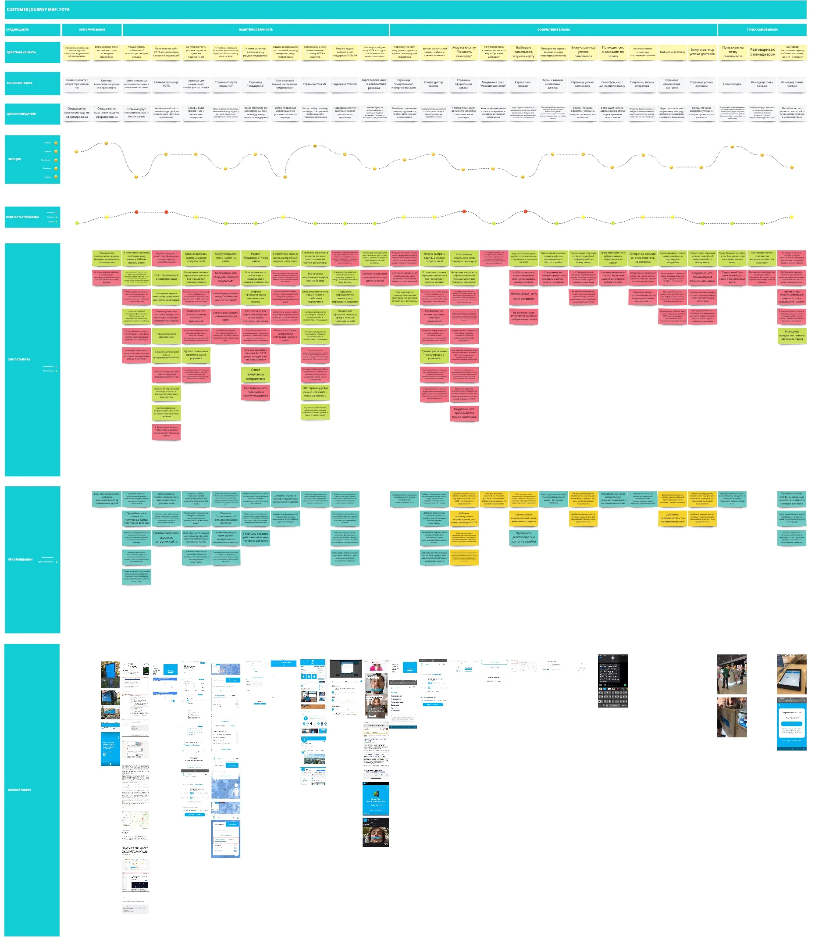
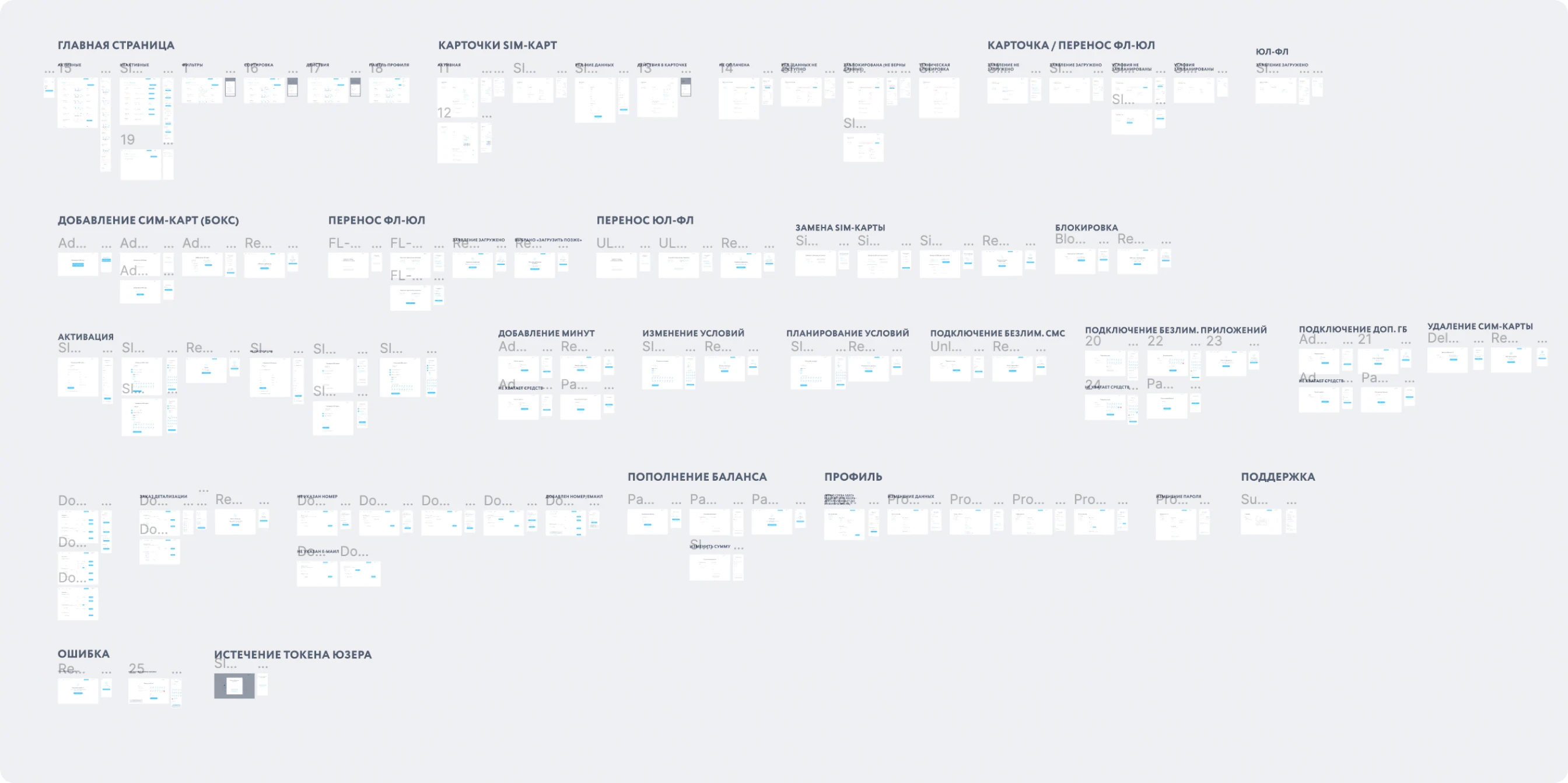
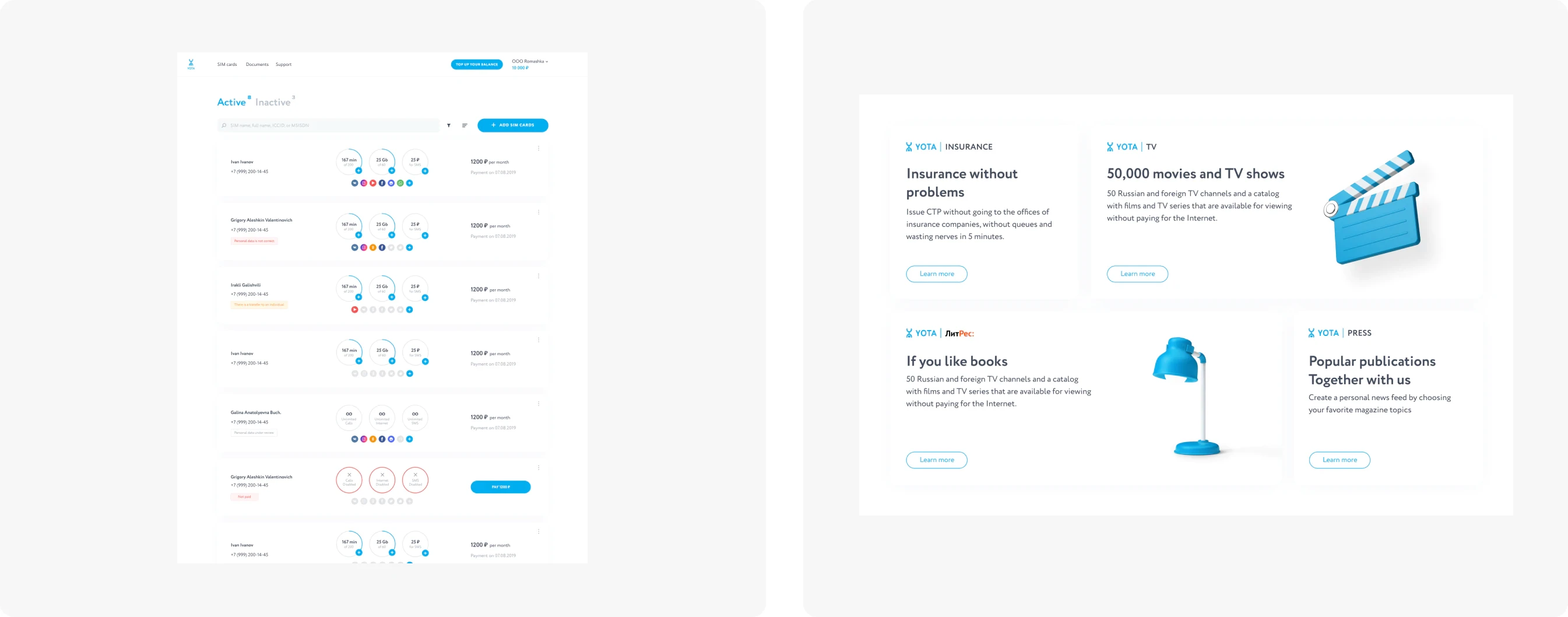
The Yota ecosystem encompasses a range of components, including the main website, user personal accounts, and sub-products like Yota Insurance, Yota Cashback, Yota Money, and more. Additionally, there’s a feature-rich mobile application, comprising numerous screens, functions, and states. This application dynamically adapts many elements to cater to specific regional requirements.



Check out other lovely projects
oneanya.design
This site is an ongoing archive of my work and was last updated on Sep, 10th 2023
oneanya.design
This site is an ongoing archive of my work and was last updated on Sep, 10th 2023
oneanya.design
This site is an ongoing archive of my work and was last updated on Sep, 10th 2023
